2012 · Ein Sprung wird zum Bild.
2013 · Wenn das Bad zur Bühne wird.

Archive story · 2012
A dive becomes an image.
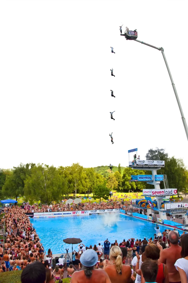
One diver, several phases of flight and a pool surrounded by people. A motion montage and two original brand designs show another side of Splashdiving: the work on its appearance.
One diver, several moments.
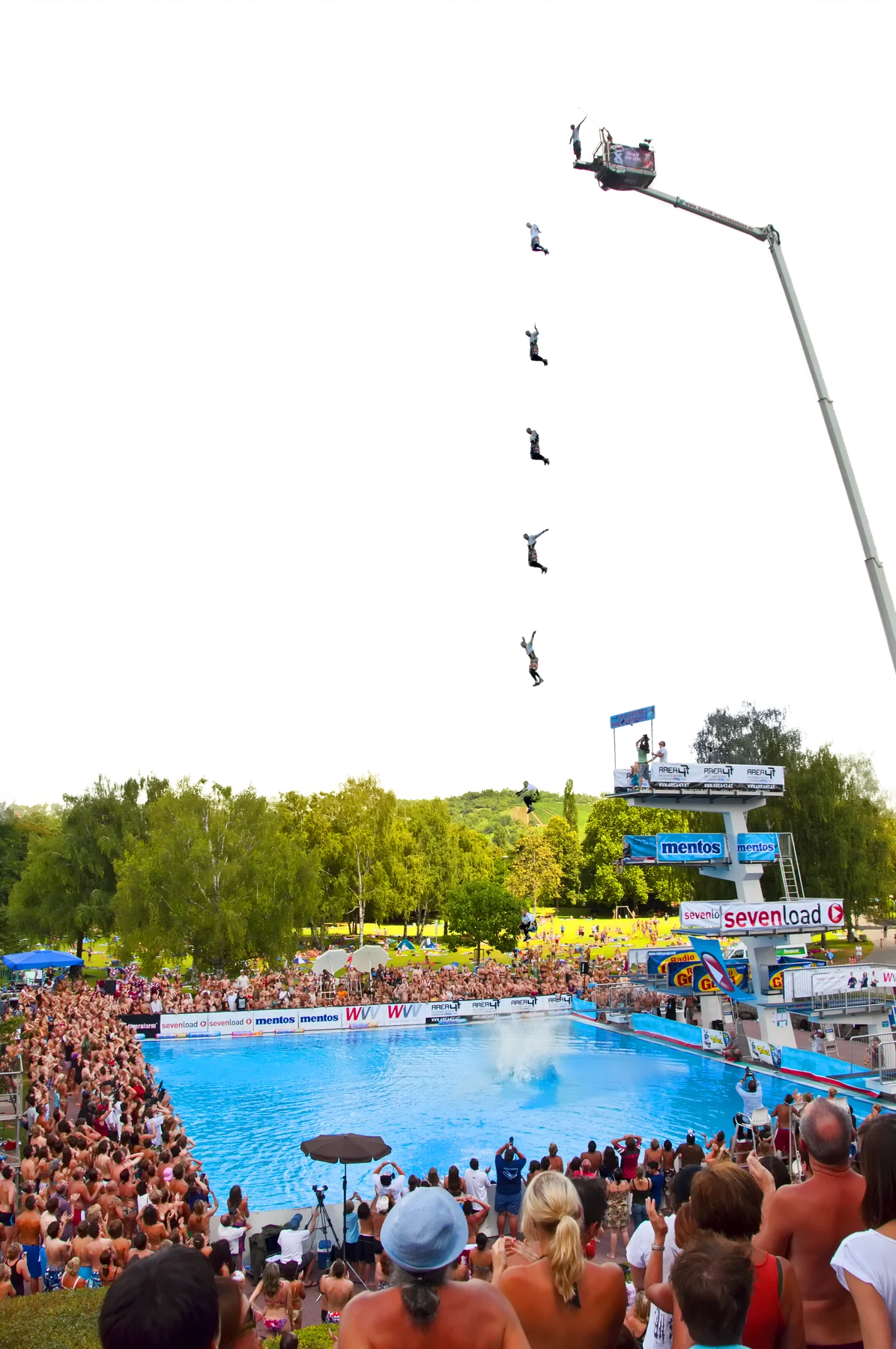
There is plenty of pale sky above the pool. Across it, the same diver appears at several points in the air. Below, people stand close together around the water. Cameras rise above their heads; in the foreground we see backs, shoulders and a blue cap.
The montage stretches out a brief flight so that several moments can be seen together. Its appeal is not only in the athlete. The pool remains in the picture, along with the people watching. Remove that lower part and something important would be missing: the setting in which the performance is being seen.
A family in red and white.
The Euro Tour and Deutsche Meisterschaft artwork belong to the same visual family. Tall red lettering, the falling-diver silhouette and a conspicuous year make the connection. One design places the year in white on a red block; the other adds an outline of Germany and two flags.
The titles change, but the shared elements remain easy to recognise. For an archive, that matters too. These files preserve not just a name but the visual form in which people could encounter it: as a tour, as a championship, as a sporting image.
This belongs to the history too.
This selection deliberately shows design work. A logo is not a results sheet, and a tour design is not proof that every stop took place. Incomplete templates are not filled in with imagined venues or winners.
What remains is worth looking at on its own terms. A sport has an appearance as well as performances, and here that appearance is concrete: red, white, a body in motion. Then the eye returns to the montage and to the people at the water’s edge. The design has a name; the pool gives it a setting.