2017 · The Loving Peace Bomb. Ein Zeichen für Frieden.
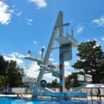
2017 · Sindelfingen. Über dem Wasser, miteinander.

Archive story · 2017
The Loving Peace Bomb. A sign for peace.
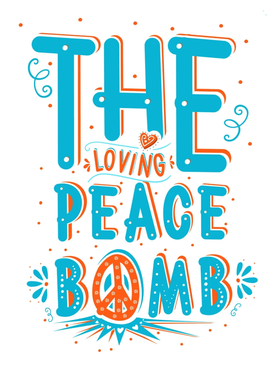
An orange wordmark, a small heart and a peace sign. The 2017 collection preserves a visual idea alongside the competition graphics.
A name that changes the tone.
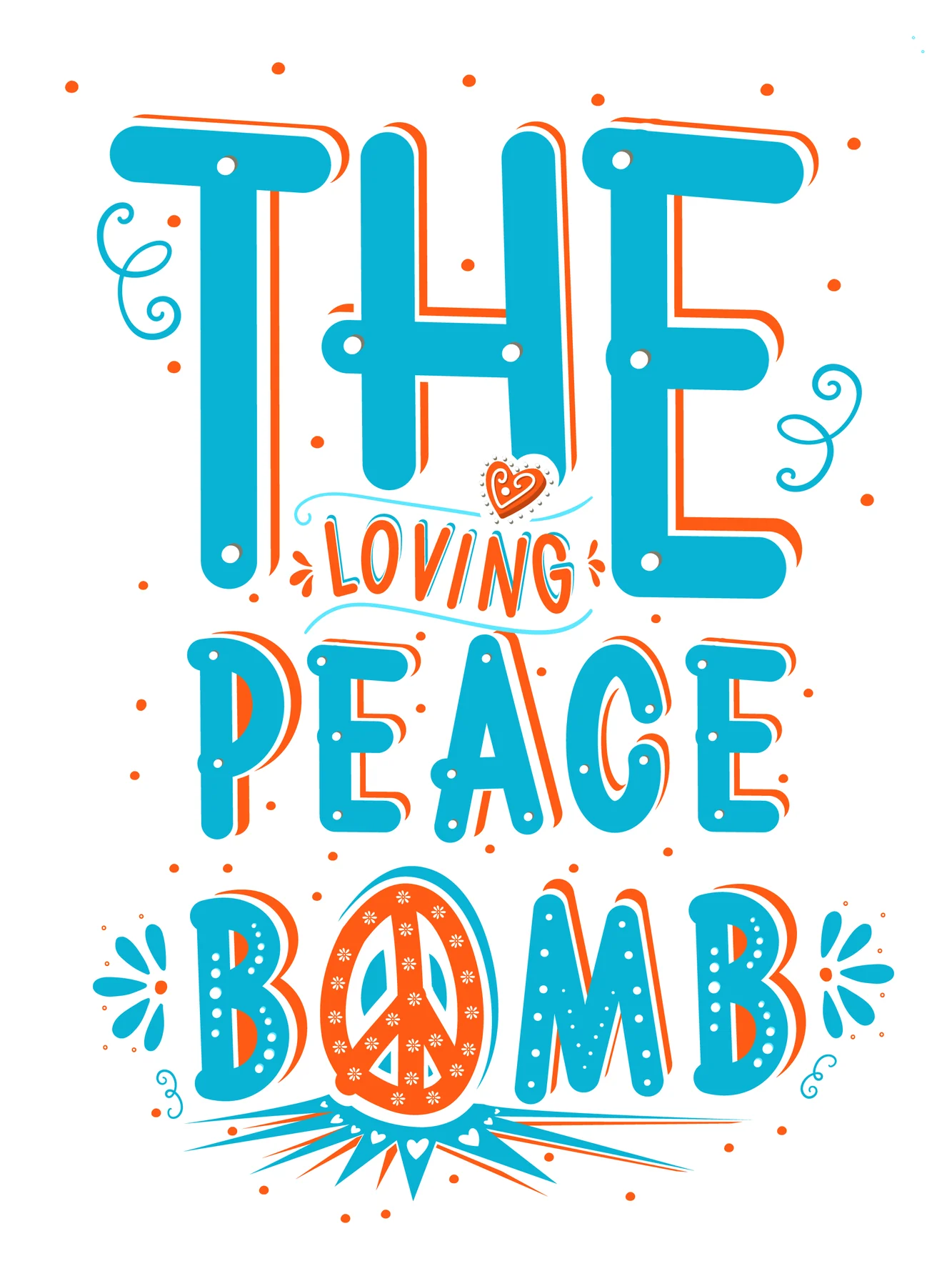
The Loving Peace Bomb combines a hand-drawn wordmark with a heart and a peace sign. Orange and turquoise give the small artwork a very different presence from a formal competition announcement.
The visual association is visible in the original itself. It invites a reading of peace and connection; it does not, on its own, establish a completed charity programme or donations.
A person in the design.
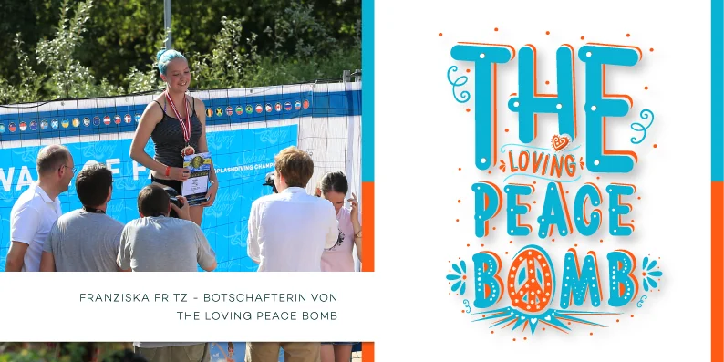
A preserved web header names Franziska Fritz as an ambassador for The Loving Peace Bomb. The design combines the campaign mark with a photograph from the 2016 presentation series.
That distinction matters: this is a 2017 design incorporating an earlier image, not a new photograph of a 2017 medal ceremony. The original web artwork is shown as an artwork, without inventing an additional event behind it.
The championship has its own mark.
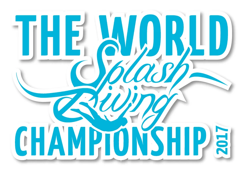
The world championship logo belongs to another part of the same supplied collection. Alongside the poster and trophy artwork, it records how the event was given a recognizable visual presence.
These documents are different pieces of work, not a single finished campaign reconstructed after the fact. Keeping them distinct makes the historical design archive richer and more accurate.
Another invitation at the Donaubad.
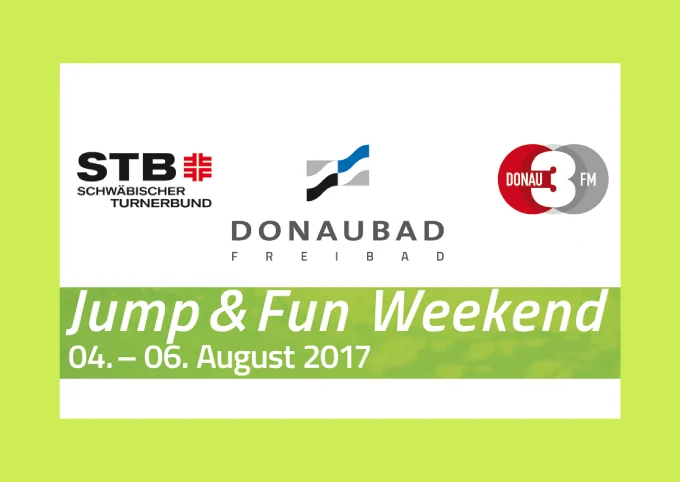
The Donaubad banner announces a Jump & Fun Weekend for 4–6 August 2017. The event name, dates and historic partner logos remain readable in the supplied artwork.
The document preserves the invitation. Without further evidence, it does not become a report that every announced activity took place. The old dates are part of the archive, not an invitation for this summer.